After losing all of my work to a technical glitch yesterday, I felt a bit reluctant to write today. That is a silly reason not to write, to be sure, but I continue to amaze myself with the excuses I can develop not to sit still with an idea and try to explain what’s on my mind. Even 19 days into writing and publishing something every day, I still have lingering moments of hesitation and reluctance before I dive back into writing again. Recognizing my reluctance and my fear is powerful, however, and I suspect that the next time I teach, I will be sure to point students to these expressions of resistance to show that, yes, no matter how many times you write and no matter how often you write, self-doubt can claw at you. It’s just a matter of getting started and seeing what happens.
Today has been a big day of diving in and taking some risks. I don’t think I’ve yet mentioned in this blog that each of us in the institute are expected to create something to exhibit at the Salt Lake City Public Library. Our work will be on display for the rest of the summer, which is pretty exciting from a public humanities perspective, but super terrifying from basically any other perspective! For the past few weeks, I’ve felt a little stumped about what to do.
My first thought was to create an entirely digital instantiation of the ideas I’ve been playing with since digital composition is certainly more my forte than print crafting, as evidenced by many of the posts in this series thus far. Yet I wanted to have something at the library that visitors could actually look at; there won’t be a computer available for people to access websites and I don’t necessarily have faith that a casual library visitor will necessarily punch in a URL they encounter into their phones (I mean, they might, but I will rarely look up a reading on the Web when I’m visiting a public space).
I decided to take on a bit of a hybrid print and digital project, which is probably a better reflection of how I do digital pedagogy work anyway. (That is, I’d say that most of my work is thinking about how to bridge reading and writing work across media and modes, so I’m excited to see that work take some instantiated shape!). Per the suggestion of one of my institute colleagues, Emily (thank you, Emily!), I’m creating a Turkish-fold map book. What that means is that I will take two pieces of book board and glue on an elaborately-folded sheet of paper that will show the key words I’m using for understanding a digital literacies framework. On those sheets of paper, I’ll also embed QR codes where users can scan the page with their phone and be taken to some curated collections of blog posts that will connect to each of the key words. So, basically, the printed book will appear to be rather simple and flat, but when the book is opened, the pages will pop out and help the reader dive into thinking about what literacy in a digital age can look like! Basically, the project itself will be an instantiation of the idea that literacy may look like a simple concept on the outside, but “folds out” into something bigger and much more complex at closer examination. A cheap metaphor? Maybe! But memorable? Hopefully!
Honestly, that all might sound really boring to someone who has not been thinking about books, books, and more books for the past three weeks, but I should have some pictures that capture the concept well soon (plus, I’ll be writing an annotation to explain the project) so that should help you all understood the work a little bit better. I’m seeing this project primarily as a way to visualize some concepts I’m mapping out for a book proposal, which a dear friend recently told me are still sounding rather “academic-y,” so I’m still going to have to keep thinking about how I translate my ideas for a non-technical audience in a clearer way.
What I’ve learned today from experimenting with the map book form is that I am much more capable of doing challenging things than I often give myself credit for. I spent a good part of my morning, for example, designing my own icons in InDesign to adorn the pages of my project. At first, I thought I would just download icons from The Noun Project and embed them directly in the pages and then I realized, “Wait, I think I can just design my own icons using some of what I know about InDesign already.” I don’t consider myself a graphic designer in the last, but all of the reading I’ve done on multimodal literacy and pedagogy echoed in my head: to be a writer, I also need to think of myself as a designer. Communicating ideas beyond the textual mode is critical to communicating my ideas.

My first stab at an icon to represent “Curation” for my book project. Curation is, to me, a crucial skill that students must develop to read and write well in a digital age, so it’s an important concept to represent clearly!

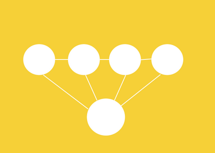
My first attempt at an icon to represent “Comprehension.” Comprehension is, to me, the ability to understand what you are reading and to explain why what you’ve read is significant. I’ve been referring to this skill as “metacognition” in other places, but I like the idea of grounding metacognition in comprehension. This concept was hard to signify visually, but I like this first attempt at seeing multiple ideas lead to an understanding of how to “frame” a key concept!
I think my icons are starting to look pretty good! They are minimalist and simple, and certainly not the same kind of work that a graphic designer would probably do. But I think drafting up an idea and seeing myself actually execute it felt really satisfying. Sure, that’s what writing is too, but thinking visually – and mocking up a visual – felt like activating a different part of my brain in a way that helps me consider how I might translate the ideas I’m playing with.
Moving flexibly between modes and forms is, of course, a large part of what communicating in a digital age looks like. We have to be willing to say that “writing” can take on a lot of different shapes and can reach people in different ways depending on where that writing lives and who receives it. This is not a particularly original claim today, but it’s the claim I’m reminded of as I teach myself to make some new things and try out some new techniques.

I love your concept for your project!
Thanks, John! Hopefully the execution works as well as the ideation!